Promotional Pack.
I want to create a pack that I can send out to studios and designers so that I can try and get placements or a job in the future. I think that the pack would include a letter head, envelope, creative CV, mini portfolio and a business card. I want to keep the pack simple, and the right scale so that they can fit through letter boxes. Although I think this would be a good idea, I think I would only use it on certain studios as each studio will react to different things. For example if I were trying to get a placement at imeus with Anthony Peters, I would send a pack with a screen printed poster in it rather than everything else, and a business card of corse.
Letterhead.
As I have already created my avatar and logo, I think that making the branding
Creative CV.
A CV is very important thing to send in a promotional pack, and I want it to reflect my personality and the design I am interested in.
I have drawn around all of the icons for the software I can use. After looking into creative CV's I found that some people put how good they are as a percentage on each of the pieces of software. But I don't want to tell future employees or someone I am trying to work for that I'm not very good at Photoshop but I know basic skills.
I also wanted to include the strengths that I have, so I decided that the best form for them would be small vector illustrations.
Putting a description by the side balances out the illustrations and explains what they actually mean.
When putting together my creative CV, I experimented with colour and layout, looking at how it would look if some bits were highlighted with pink. Although I found that they all look horrible and I should definitely not use them, I think I got a bit over excited with the pink.
I decided that I would include my avatar on my creative CV, as it's nice for the audience to see what kind of work I like to produce, also they can see who they will be working with potentially.
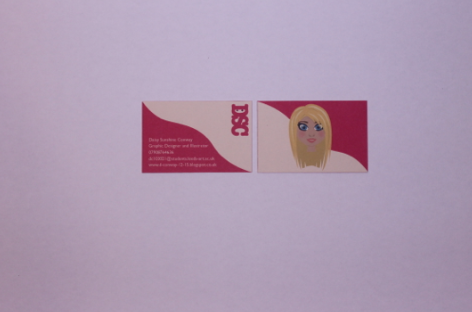
Business cards.
I put my avatar on my business cards for the same reason. I think that it is nice for a client or anyone who wants to have one of my busienss cards to see what I will look like. It will put a face to a name. I also think that it will show them the kind of work I like to design.
I stuck to the colour scheme throughout the designing of all of my pack.
I decided to add the colour to the back of the business card as well as the front. I think that this looks more aesthetically pleasing and consistent with the rest of my branding.
I wanted to include only the necessary information on my business cards as I didn't want them to be too cluttered.
I have considered printing double sided onto the business cards, but I think that I am going to duplex them by putting a sheet of pink card through the middle, this will give a good effect. It will also make the business cards thicker and more sturdy.
Invoice.
I will need an invoice, although if I was mailing this out to studios I wouldn't be including an invoice in the pack with prices on as I think that that is a bit forward. For the design of my invoices I just used the same layout as my letter head and creative CV, then researched what invoices would look like to find out the information I needed to include on it.
Envelope.
I will need an envelope for my pack so that the letter head will go inside it. I decided to put my address on the front just to show an example of what it would look like.
CD Case.
The reason why I have produced a CD cover is so that I could put it in my pack if I had any pdf's or hopefully in the future after effects files, as this is a software I am really interested in learning. Although for hand in I will be putting my proposed website on it, just to show how it would work.
Net for File.
I thought about having just a plain pink file, but due to lack of time I found it hard to colour match the ink to a stock, therefore I thought to keep it all consistent I would print out the net for the file on the stock that I am already using to make sure that it is the same colour.
Final Self Branding Pack.
 |
| Pack |
 |
| Inside Pack |
 |
| Letterhead |
 |
| Invoice |
 |
| Creative CV |
 |
| Envelope |
 |
| CD Cover |
 |
| Mini Portfolio |
 |
| Business Cards |
 |
| All A4 Letters |
Evaluation.
When I printed my self branding pack I really didn't like it and thought that the colours were too much, although after putting the pack together, I think that it works well. The pink ninja is something that is light hearted just like I am, not to serious and quite fun. Pink is a colour I love, it is also quite a vibrant colour which means that it will be noticed and will stick in peoples heads. I think as I develop as a designer I want to pick up the name, 'The Pink Ninja' but as of right now I don't think that I can pull it off, or have the portfolio to back it. This is something that I can hopefully achieve by the third year.
In respect to sending out my promotional pack, I don't think I will actually send it out this summer unless I amend it. Because of the time limit I rushed it a bit and I don't think it's my best work. I also think that it might not always be appropriate to send this pack as different studios will react to different things. I think each studio, depending on what kind of studio and how much I want it, will have their own personal touch. If I were to do this brief again I would have tried to produce something that the studios would want to keep, use and interact with.


No comments:
Post a Comment