Wednesday 26 February 2014

Endangered Animal Publication Crit

The Crit.
For this crit we needed to bring mock ups of our publication so car, and mock ups of how we are going to package it, this is so that we can get the opinions of our peers so that we can move forward with it. We were put into groups, and we had an allotted time to go through each of our publications and how we are going to bind them, and package them. We then went around our group and commented on the strengths, weaknesses and considerations for each of their publications and packaging.

My Feedback.
Strengths.
  • The net you have chosen to package your final pages is engaging and interactive. +3
  • Good continuity between your spreads.
  • Great alternative binding technique, appropriate for endangered species. +3
  • Binding is interesting and attractive, no glue makes it more environmentally friendly. +1
  • Love the binding, it is different and unique, it will enhance content by engaging with audience.
Weaknesses.
  • Would consider splitting the body copy into two columns as the line length could be too long for the eye to follow. +1
  • Remove hyphenation. +2
  • Change the cover it looks too much like 'FA' unfortunately. +1
  • Cover looks like EA sports.
  • Drop your own photographs from the zoo where possible, these will probably be a higher quality. +1 - As long as they are good enough.
  • Could add a coloured filter over your own photos to keep them consistent.
Considerations.
  • Perhaps refine the logo for the front page as it does look like 'FA' at the moment.
  • Consider altering margins - when the audience hold the book, their thumb may cover content etc. try this physically. +3
  • Page numbers is your including a content page.
  • You could do the front logo so that the E and A overlap and link together, possibly use different colours? +1
  • Does your publication need a logo yet? Or at all? - This could be something you focus on the next part of the brief.
I got a lot from this crit, I thought that it worked really well and all of the feedback I received was constructive and will help me with my brief. I will be looking into my front cover and changing that, maybe just showing it as 'Endangered Animals' rather than 'EA'. I also need to consider that the body copy may be too close to the edge, which will be hard for people to read. I think that I have a lot of information that I need to fit into my publication, therefore I may need make the actual size of the publication larger. I will definitely be removing the hyphenation in my copy as I don't like it, and neither does anyone else.

Friday 21 February 2014

Research Crit

Endangered Animal Research Crit.
I decided that I was going to research into Endangered Animals for my topic as it is something that I am really interested in.
I started looking into adoption packs, information about the animals, Illustrations that have been made, and the design that has been influenced through endangered animals. This was a very informal crit, receiving feedback on my design boards, and the ideas I would like to go into when making my 16 page publication.  I have decided that I will be making a publication about the endangered animals that I have chosen and maybe some of the organisations that help them. This crit was really help as I could see what other people were doing, also people could give me feedback on my ideas, and where I could possibly take it.

Wednesday 5 February 2014

Studio IMEUS

Anthony Peters.
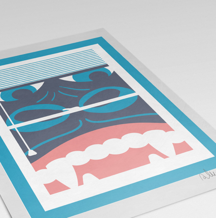
Studio Imeus is a small multi-disciplinary studio on the South Coast of England within a stones-throw of Brighton. Set up in 2006 by Anthony Peters whilst he worked as a designer/retoucher and general pre-press wizard for The Art Group.The idea initially was to indulge the creative work that couldn't be done at the day job, however it soon became impossible to juggle the two and in 2011 Studio Imeus became a full time hobby...Today the studio calls on a collective of regular collaborators, contributors and co-conspirators drafted in when the project requires it, which ultimately means we can offer a broader array of approaches and solutions to client briefs. http://www.imeusdesign.co.uk/info/

I have always admired Anthony Peters, I think that the screen prints he produces are amazing, and he is someone I have always wanted to work with. I think that over the summer I will try to get in contact with him.

http://www.imeusdesign.co.uk/
'Anthony Peters from Studio Imeus has collaborated with Print Club London a few times every year since back in 2009 when his 'Nina' edition of 40 prints sold out in a matter of hours at the Secret Blisters Show. We have worked with Print Club in all their Blisters shows since then, as well as exhibiting with them at Pick Me Up and the Somerset House / Film 4 Summer Screen exhibition.' http://www.imeusdesign.co.uk/printclublondon

Screen Prints.


 The Shop.


Double act book.
'During the course of 2014 the studio will be undertaking the mammoth task of illustration 100 movie pairs with view to getting a 200 page book published by the end of the year. All illustrations will comprise of the same  3 colours (and their overprinted combinations) and a very specific character style.' http://www.imeusdesign.co.uk/doubleact

Getting in touch.
IMEUS has a contact us page, where if you want to work with them, fill in the form and send it off. Although I think that this will encourage people to send emails even if they aren't that bothered. I also think that they will see numerous emails and it won't grab their attention. If I were to contact Anthony Peters at IMEUS, I would produce my own screen print, using various colours, to show that I can screen print and that I am interested in it. Then I would male it to him, with a personal yet professional letter saying that I would love to work with him, and put a business card inside and information so that he would be able to get back in touch. I think different methods of approaching studios depend on what the studio is, and what they would be looking for in an intern.