When I received this brief I relised that I don't need to research into me as all of my PPP posts are me and the things I am interested in, so I after thinking about what I want to do for my pack I found that I want to research different logos and packaging.
Logo;
 |
| http://www.logoed.co.uk/2013/03/26/the-mark/ |
What I like about this logo is that it is simple using only geometric shapes to form the name and the logo, also I love the way it has been branded, everything is the same which keeps the brand consistent, using the same colours and stock. Also I wouldn't have just those colours together, although I think that they work really well.
 |
| http://www.logoed.co.uk/2012/08/13/creative-space/ |
What I like about this logo is the simplicity in it, sans serif typeface, the white type on yellow background works really well, it is something that someone would remember due to the minimalism in it.
 |
| http://www.logoed.co.uk/2012/07/26/reserve/ |
The typeface which is used in this logo design is something that I want to experiment with as I think that it looks really professional, although I'm not sure whether it would work for me or be appropriate, although it is something I want to try.
 |
| http://www.logoed.co.uk/2012/03/27/lark/ |
I am a big fan of negative space, I think that it is something that makes a design interesting, having a hidden meaning behind a design which makes the concept more clear is such a smart way yo work, and I envy people who can do this effectively. I think that this works because it is very discrete and small but still effective. This will influence my design as I want mine to include a hidden image, although is is something that I have never done before and find it difficult to make the image relevant or look right.
 |
| http://www.logoed.co.uk/2012/01/13/massive/ |
This has influenced my design as it shows the difference between a dark logo on light stock and vica verca, this has shown me how a light logo on a dark background brings the logo out and makes it more effective. In my logo I want to try and screen print so that I can use this effect.
 |
| http://www.logoed.co.uk/2011/08/18/poogans-porch/ |
I think that this logo would look really good if it was foiled, this is why I liked it as it flows really well. I don't think that it is the kind of logo I would go for as I would like something more simple, but having patterns around it like that would look good foiled.
 |
| http://www.logoed.co.uk/2011/05/19/looklook/ |
This logo is very clever as it is the same upside down as it is the normal way, I also like the business cards as the logo in white on top of a black card in the center of the card is a big statement and I think it is very effective and it makes the logo stay in your mind, this is something which I could consider when making my business cards.
 |
| http://dribbble.com/shots/151415-Globarista |
I have found this and saved it because I really like the colours, I like the fact that it is quite neutral also that all the colours are quite similar, I think that the colours work well togther, they are appropriate for how they are used. This is an effect that I want to have with my pack, I want all of my colours to compliment each other.
Packaging;
 |
| http://lain56.deviantart.com/art/3D-Project-2-Floppy-Disc-Box-79351604 |
What I like most about this packaging is the colours that are used, I could also use this sort of packaging for my business cards, or maybe offer a business card holder in my pack with my business card being the first one they have. This would be something that people would never think to need but would be very useful.
 |
| http://www.hastaladesign.com/?tag=tissue-box-packaging |
Creative and simple packaging, this is exactly what effect I want to have with my packaging. The colours that have been used are quite pastely, also the tone of voice for the packaging is humorous, this is what makes it so interesting, and this is what I want to achieve in my design. I think what makes it more effective is that there are more than one boxes, the other boxes allow the humour to come through.
Designers and Studios;
Denis Carrier;
 |
| http://studiofolk.com/EDITORIAL-ILLUSTRATION-1 |
I started to look at Denis Carrier when I found one of his editorial designs in InD Magazine, since then I looked through his work and found him to be inspirational for my design. He starts with an idea, and starts to create illustrations from that, his designs are often humorous, and they are always effective. A lot of Denis Carriers designs start with illustrations, but always end in a good quality design, with a minimal colour palate, which are usually neutral and pastel colours with a professional finish. He influences my work with the way he does small illustrations of objects, taking something complex and making it simple and effective, this is something that I try to do with my work, having an effective illustration says a lot more than an image.
Noma Bar;
 |
| http://www.dutchuncle.co.uk/illustrators/noma-bar/portfolios/portfolio |
Noma Bar is a designer who I have been looking at for the past few years, I think that his work is amazing. He uses negative space in a very clever way, to allow the design to have two or more meanings, it shows hidden images to make the message he is trying to communicate clearer. Noma bar works with a limited colour palette and throughout his designs he often uses some of the same colours, therefore whenever I see this colour on Noma Bars design ‘Business is War’ it remind me of him and his designs. Noma Bar is a designer I would love to meet and try to become as successful as within design, he influences my work with his use of simple shapes, colours and how effective something so minimal can be.
Anthony Peters;
 |
| http://imeusdesign.4ormat.com/ |
During my first year I found that I enjoy doing screen prints as I believe that they leave a clean and clear finish to the design, Anthony Peters does this very well. Using only two colours plus stock Anthony Peters allowed his print to be very aesthetically pleasing and has actually sold out of this print on his website, which shows it has been successful. The prints he produced influenced my design in Speaking from Experience, as I created a poster using limited colours as I believe that it works really well. During second year I plan to do a lot more screen prints in my design process, and Anthony Peters is a designer I will continue to follow and look into, as he influences my work greatly.
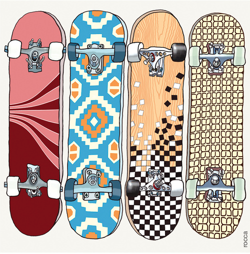
Paul Rocca;
 |
| http://www.blackolivestudio.co.uk/collections/rocca |
I found this card in my local supermarket, I had to buy it as I think that it is an amazing piece of design, the illustration is very effective, the card is not specific towards a birthday or special occasion which means it can be used for anything. Paul Rocca has a series of these cards, which all derive from objects or vehicles which have been illustrated in more of a simple way than an image although still very detailed so that its not too cluttered. The colours that he has used in this design are very appropriate for the design, this is another reason why I follow this designer, as his colours are always appropriate to the Although I don’t do illustrations which are this detailed I think it works really well and may try experiment with it in my design.
PPS - Professional Packaging Services;
 |
| http://www.p-p-s-ltd.com/index.html |
Through the first year I found that in all of my briefs I have been drawn towards doing packaging, as I find it really fascinating, and believe that people will buy one product over another due to their packaging of the product. PPS is a very successful company based in Leeds, it creates many different kinds of packaging from very simple and minimal design to really creative designs. They have done a lot of designs for drinks packaging, I found that it is very high end drinks which means they have a higher budget and allows them to have a bit of freedom when it comes to the design. PPS would be a good place for me to do work experience as it will allow me to learn more about the packaging industry and I will be able to see if this is the direction I want to go in.