Construct.
This is a design studio that I have found and am very interested in. this is how they describe themselves.
What I like about this studio is the range of work that they produce, they are mainly based on doing branding and identity. But within this I have seen that they create different packaging styles, which is one of the main attractions to this studio for me. It is a studio that I would love to get in contact with.
'Construct created a limited-edition carrier bag design for Harvey
Nichols to commemorate a year of key British celebrations. The new
design uses London-inspired iconography in a year during which the
Queen’s Diamond Jubilee and the 2012 Olympics have kept Britain firmly
in the international spotlight. The design showcases four British icons
in bronze, silver and gold – the famous Gilbert Scott telephone box, the
double-decker bus, black cab and (of course) Harvey Nichols –
representing what international visitors know and love about London. The
limited edition carrier comes in five sizes, each identified by a
corresponding gold number. The Sloane Street windows celebrate the
‘delivery’ of the carrier bags with an installation featuring a
specially-designed Harvey Nichols lorry, while the packaging is also
incorporated in the Knightsbridge windows as part of the Queen’s Diamond
Jubilee retrospective.'
Source
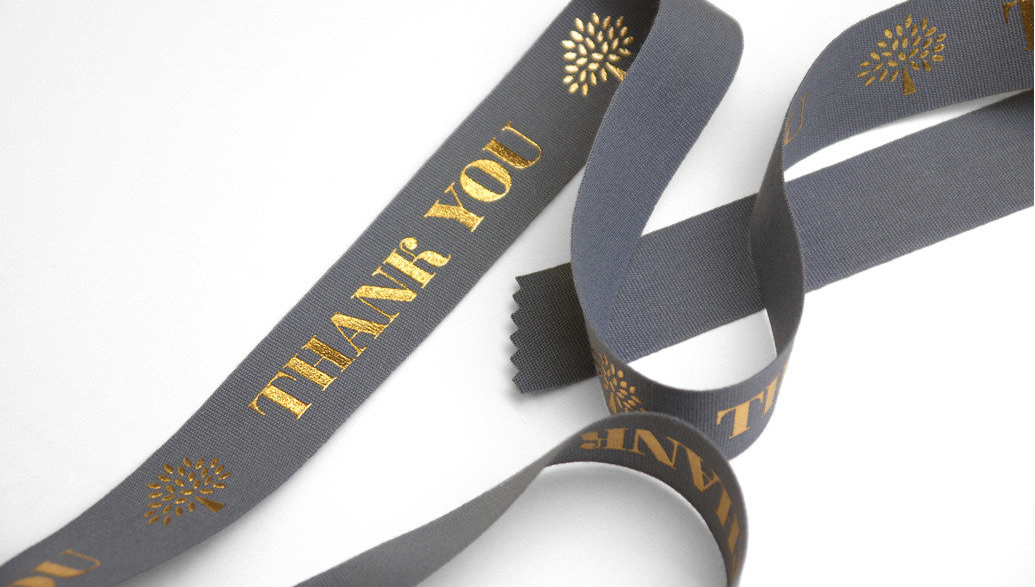
'An ongoing programme of work, which started in 2006, has included the
refinement of the Mulberry logotype and famous tree marque, corporate
communications, environmentally responsible packaging, as well as
branding and communications guidelines for Mulberry Seasons Christmas
2009, AW2010, SS2011, AW2011, SS2012 and AW2012.'
Source


'Construct’s extensive and ongoing design programme for this luxurious
English institution expresses the hotel’s Art Deco heritage, timeless
glamour, and uniquely attentive form of traditional English service. The
new identity created by Construct is an evolution of the hotel's
established identity: the crest has been redrawn and a refined version
of the typeface SangBleu (Blue Blood) has been introduced for the
logotype to express the hotel’s heritage with elegance and restraint.
This refined identity is contrasted with a bold and opulent brand
palette inspired by the hotel's architecture and features. The Art
Deco-influenced palette includes strong black and white chevrons and
geometric patterns, contrasted with a fresh jade colour inspired by the
original Art Deco bathrooms in the hotel. Construct have already
designed more than 200 applications for the hotel, from carrier bags to
rocking horses, and menus to umbrellas. One item, the silk kimono for
suite guests, has already been identified as an heirloom piece by
Liberty and the V&A.'
Source
I think that communicating with the studios in the right way, is the only way to contact them. they would be looking for professional work with clean finishes. If I were to contact Construct, I would send a mini portfolio or examples of branding that I have produced with finishes such as foiling, as I can see this is something that they are interested in. Having similar interests is the best way to get in touch with studios as they will relate to you and see how you know you research about their company and you are serious about joining their team.


No comments:
Post a Comment