Friday, 24 January 2014

Final Crit - The Body Shop

Final Body Shop Crit.
I went into this crit with three of my four posters finished and without my social campaign or interactive. The deadline for this brief isn't for a while yet and although I would have liked to have finished my Body Shop brief by now, I needed a crit on what I had done to this point so that I could move forward. I think that changing the audience of The Body Shop brief is risky and the method of advertising the products is also pushing it. I want to see the opinions of my peers, so I can move on or change my idea.

Design Boards.
The Feedback.
Comment on the effectiveness of the product/proposal in relation to the original brief.
Strengths.
You have changed the brief but made it different - unique - it makes much more of an impact being aimed at men. Humour is also a great addition.
Suggestions.
-

Comment on the appropriateness to the response to the identified target audience and/or context.
Strengths.
As you have said humour works well for the male audience.
Suggestions.
The coconut image would appeal to men more than the others. Perhaps make the eye and lips more 'seductive' to really catch males attention. Pink colour initially looks like it is aimed at women, obviously there will be women influences but not sure males will notice/pay attention to this.

Comment on the visual quality of the final resolution.
Strengths.
Brown and other muted colours work well for body shop, look natural but still bold, lots of impact.
Suggestions.
Is the font Bebas? Not sure if this is a commercial font. If not you could experiment with a more organic font, less bold. Could use different layouts for different products.

Comment on the quality of the presentation of the product/proposal.
Strengths.
Boards are really good as they show your development and thoughts rather than just finals.
Suggestions.
Print out some large scale versions of posters, experiment with stock. Board quality could be improved.

General comment on work presented.
Keep pushing the concept. It it a really interesting ideas but I think it could go further.

What I took from the crit.
I have taken a lot from this crit, I think that I should change the illustrations to make them more seductive, I was holding back, thinking that it might be too much, but from this feedback I have found that its not enough. Th comment about the colour pink, and that men won't connect with it, I think that they will as it is a skin colour with a pair of lips on it, which will make them think of a women's face. All of the feedback I have received form this crit has been very helpful and I will take it all on board. I especially appreciate the comment about the typeface 'Bebas' as I completely forgot to check and see if it was a commercial typeface, and I have found that it isn't. Therefore this is something that I will change about my posters.

Friday, 17 January 2014

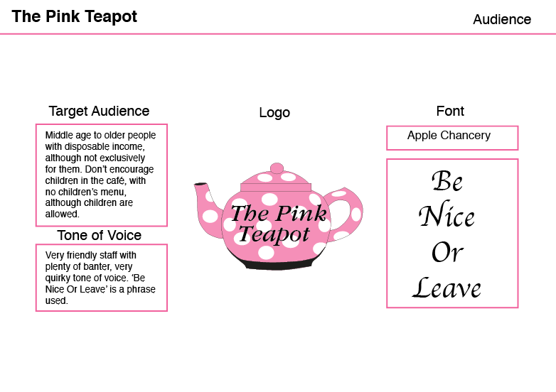
Progress Crit - The Pink Teapot

The Session;
I was previously doing the body shop brief for these sessions but as the deadline for this brief is closer I decided that I would rather have a crit on this work for The Pink Teapot, also I don't have enough design work to be critted on The Body Shop brief, and I think that this would be more helpful for me. 

Design Boards.


Questions asked to answer.
How well does the work presented communicate the concept/product/context?
Does the solution answer the brief?
Are the methods of distribution appropriate?
Is the concept clear and appropriate?
Have decisions been made from an informed point of view?
Is there a clear audience and is the solution appropriate to 'them'?

Feedback.
Yes the solution answers the brief so far. The methods of distribution are appropriate for the cafe. The decisions have clearly been made from an informed point of view, a lot of knowledge of the cafe shown. Could do cake boxes with the same top as vouchers.

What I have taken.
It would be a good idea to do the cake boxes the same as the vouchers, although the client is wanting the cake boxes to be low cost due to the high demand of take out cakes, and the low cost of the cakes themselves. The boards that I have produced, I am not happy with and I will definitely need to spend more time with the final boards. Other than that I just need to continue to produce more of what the client has asked for.

Wednesday, 8 January 2014

Print and Web Progress Critique

The Crit;
During this crit we all had ten minutes each to show our ideas and development so far on each of our briefs. Whilst we are talking about our work the person to our left is writing down note and feedback from the group so that the crit would be more thorough and quick.

Feedback;
Strengths.
  • Blue is preferred for letterhead as the stock.
  • Curved business cards in blue.
  • Group like the mixed stock for the business cards.
  • Good experimentation of stock and packaging.
Weaknesses.
  • Maybe re-think the store/have it as a specially branded range that is made available withing a store like paperchase.
Considerations.
  • Consider changing idea from a shop to a section in a shop.
  • Consider stocks.
  • Consider audience. 
What I have taken.
I have chosen the business card that I want to use, I originally thought about using the same stock on the front and back and a colour in the middle, but I have found from my group prefer the two different stocks. They said that having two different coloured stocks and textured stocks means that when you are looking at the front you want to turn it round to see the back as it feels different.
I need to consider weather I am going to have a shop or a range in a shop.
This crit has been very useful as it has brought a lot of things to light, I now know what I need to do and consider, this is good so I can move forward with my work.